An expense-tracking design where budget categories are built by the person rather than imposed by the app, shown as a visual tree instead of a list.
Overview
Situation
Budgeting apps assume a person already knows their categories. They open onto a list of spending buckets copied from accounting, and the first thing a new user has to do is agree with someone else's idea of how their money is organized.
That is the step where people quit, because a budget that does not match how someone actually spends is one they have to translate every time they use it.
Task
Design an expense-tracking experience where the categories come from the person rather than the app.
Action
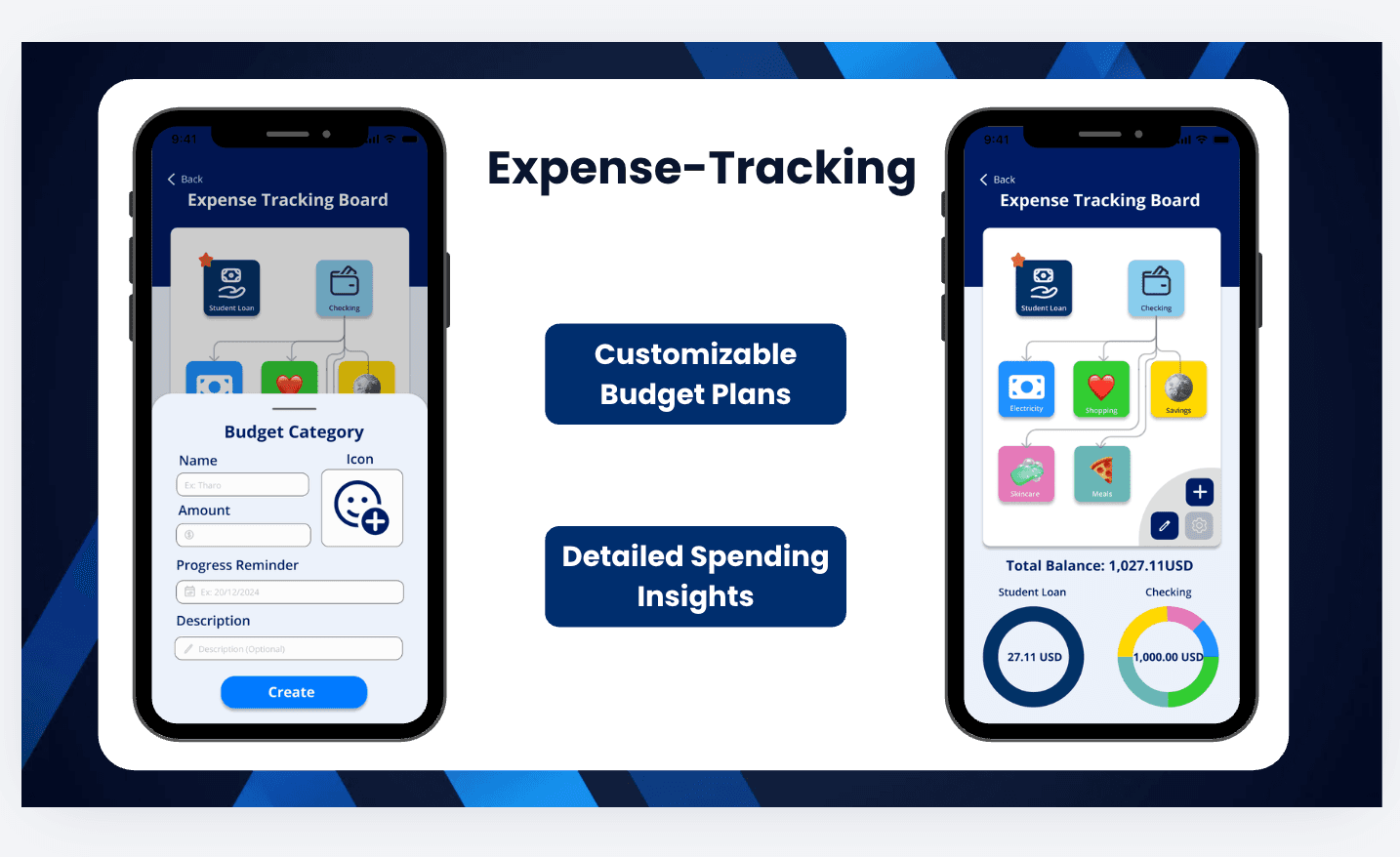
I designed the tracking board as a visual tree rather than a list. Accounts sit at the top (student loan, checking) and branch into the categories underneath, so a user can see where money comes from and where it goes in one view instead of scrolling two screens.
Creating a category is deliberately short: name, icon, amount, an optional progress reminder date, and an optional description. Icons carry the recognition, so a category is identifiable at a glance without reading its label.
Balances render as rings rather than numbers alone, one per account, with the category split shown in colour around the total. The result is a screen a person can read in a second and edit in a few taps.
Result
A design that treats categories as personal structure rather than fixed taxonomy, and shows both the shape of a budget and its current state on one screen.